Transform your garden knowledge into compelling visual stories by layering temperature zones, rainfall patterns, and bloom schedules onto simple charts that reveal planting windows at a glance. Map your vegetable yields against soil amendment dates to identify which organic treatments actually boosted production, creating a visual record that guides next season’s decisions. Track companion planting success rates through color-coded diagrams showing which pairings reduced pests by 40% versus those that showed minimal benefit.
Garden infographics turn months of observations into instant understanding. A timeline showing your tomato harvest alongside weekly watering amounts might reveal that less frequent, deeper watering produced 30% more fruit than daily shallow sprinkles. A comparison chart displaying lettuce varieties grown in partial shade versus full sun provides visual proof of which thrived in your specific microclimate, eliminating guesswork for future plantings.
These visual tools serve double duty in your gardening journey. They help you analyze what worked and what flopped, transforming scattered notes into clear patterns. They also become teaching tools when sharing knowledge with fellow gardeners or planning community garden layouts.
The most effective garden data visualizations don’t require design expertise. Simple bar graphs comparing compost types, calendars marking frost dates against actual temperature drops, or sketched garden maps noting sunny spots throughout the day all qualify as infographics. What matters is capturing your real-world results in formats that make patterns obvious and decisions easier.
Why Your Brain Loves Garden Data in Pictures
The Information Overload Problem
When I first started gardening, I remember feeling completely overwhelmed by thick gardening manuals filled with dense paragraphs and complex instructions. Should I plant my tomatoes in full sun or partial shade? How much water does basil really need? The answers were buried somewhere in pages of text, and by the time I found them, I’d often forgotten what I was looking for in the first place.
This is the challenge many new gardeners face today. Traditional guides, while thorough, can bombard you with so much information that it becomes paralyzing rather than helpful. You might spend an hour reading about soil pH levels when all you really need to know is whether your lettuce prefers acidic or alkaline conditions.
Here’s where infographics change everything. Instead of wading through paragraphs, you can glance at a visual chart that shows optimal planting times for different vegetables in your region. A simple color-coded diagram can instantly tell you which plants make good companions and which ones to keep apart. The beauty of data visualization in gardening is that it transforms complex information into quick, actionable decisions. You spend less time researching and more time actually getting your hands in the soil, which is what gardening should really be about.
Making Sense of Numbers at a Glance
Let’s be honest—staring at a pile of seed packets with different spacing requirements can make your head spin! That’s where well-designed infographics become your garden’s best friend. Instead of calculating how many tomato plants fit in your 4×8 raised bed, a simple visual chart shows you instantly. Think of it like reading a map versus written directions—both get you there, but one just clicks faster.
When you’re planning your vegetable garden, infographics turn confusing data into friendly pictures. A color-coded hardiness zone map instantly tells you whether that gorgeous peach tree will survive your winters. Yield comparison charts help you see at a glance that those six zucchini plants might produce enough to feed the entire neighborhood! Similarly, visual garden documentation captures growth patterns that numbers alone can’t convey.
The beauty of data visualization is that it removes the guesswork. A spacing diagram shows exactly where each plant goes, while growth timeline graphics reveal when you’ll harvest those first crisp lettuce leaves. No calculators needed—just quick, confident decisions that help your garden thrive.
Garden Infographics That Solve Real Problems
Planting Calendars and Seasonal Guides
Planting calendars transform confusing timing decisions into clear, visual guides that take the stress out of scheduling your garden tasks. These colorful timelines show exactly when to start seeds indoors, transplant seedlings, and direct sow based on your specific growing zone and last frost date. You’ll find month-by-month breakdowns that highlight optimal planting windows for vegetables, herbs, and flowers, often color-coded by season for quick reference.
The best planting calendar infographics include local frost date ranges and countdowns, helping you work backward from that crucial spring marker. Many also feature companion planting suggestions right alongside timing recommendations, combining tested gardening methods into one handy resource. Some gardeners print these calendars and post them in their potting shed, checking off tasks as seasons progress. Whether you’re planning succession plantings for continuous harvests or timing cool-season crops, these visual schedules eliminate the guesswork and help you make the most of your growing season.
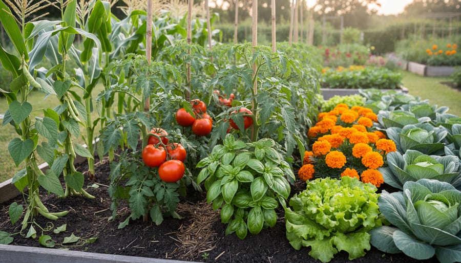
Companion Planting Charts
Companion planting charts are absolute game-changers when it comes to planning your garden layout. These visual guides take the guesswork out of figuring out which plants are best friends and which are natural enemies. Instead of memorizing countless plant combinations, you can simply glance at a colorful chart that shows which vegetables, herbs, and flowers support each other’s growth.
These infographics typically use color-coding or simple symbols to indicate beneficial partnerships. For example, you’ll quickly see that tomatoes love basil but should avoid cabbage. The beauty of these charts is that they explain why certain pairings work—whether it’s pest control, nutrient sharing, or providing necessary shade. I’ve watched countless beginning gardeners transform their yields simply by consulting these visual guides before planting season.
Many charts also highlight spacing requirements and timing, making them invaluable planning tools. You can print them out and bring them right to your garden beds, eliminating those “wait, what goes where?” moments we’ve all experienced!
Spacing and Layout Diagrams
One of the most practical applications of garden infographics is visualizing how to maximize your growing space. Spacing and layout diagrams take the guesswork out of planning, showing you exactly where each plant should go and how much room it needs to thrive.
Square foot gardening infographics are particularly helpful for beginners. These visuals divide your bed into equal sections and indicate how many plants fit per square. For instance, you might see that one tomato plant occupies a full square, while sixteen radishes can share the same space. It’s like having a planting blueprint at your fingertips.
Container arrangement diagrams are equally valuable, especially for balcony and patio gardeners. These infographics demonstrate companion planting in pots, showing how to combine herbs with vegetables or flowers with greens to create productive, beautiful containers.
I’ve found these spacing guides incredibly reassuring when I’m second-guessing myself during planting season. Master gardener Rebecca Chen shared with me that she always keeps spacing infographics laminated in her garden shed, referring to them season after season to ensure optimal yields and healthy plant development.
Pest and Disease Identification Visuals
When your plants aren’t looking their best, diagnostic infographics become your garden’s medical reference guide. These visual tools display side-by-side comparisons of common issues, making it easy to distinguish between pest damage and disease symptoms at a glance.
The most effective diagnostic infographics organize information by plant type or symptom category. For instance, a tomato troubleshooting chart might show photos of blight, blossom end rot, and hornworm damage alongside identifying characteristics like leaf patterns, fruit spotting, or visible insects. Color-coded severity indicators help you understand whether immediate action is needed.
I’ve found these visuals especially helpful when timing is critical. Instead of flipping through multiple resource pages, you can quickly match what you’re seeing in your garden to clear images. Many successful infographics include measurement scales too, showing you exactly how large those suspicious holes should be before you worry.
Master gardener Elizabeth Chen shared with me that she keeps laminated pest and disease identification charts in her shed. “When something goes wrong, I grab my chart and make an accurate diagnosis within minutes,” she explains. “It’s saved countless plants from receiving the wrong treatment.”
Consider creating a personalized reference guide with photos from your own garden alongside standard diagnostic images for even quicker identification next season.
Creating Your Own Garden Data Visuals
What Garden Data Is Worth Tracking
The beauty of tracking garden data lies in discovering what makes your unique growing space thrive. Start by recording your harvest yields—not just the total weight, but which varieties produce best in your conditions. I’ve found that noting when crops peak helps me stagger plantings for continuous harvests throughout the season.
Weather patterns are absolutely essential. Track rainfall amounts, temperature highs and lows, and frost dates. These records become your personalized growing guide, far more accurate than general zone maps. One experienced gardener I spoke with credits her detailed weather logs with helping her time plantings perfectly, boosting her success rate by nearly 40 percent.
Planting success rates deserve attention too. Which seeds germinated best? Did transplants outperform direct sowing? Recording these details eliminates guesswork for future seasons.
Don’t overlook soil test results taken annually or biannually. Tracking pH levels, nutrient content, and organic matter changes shows whether your soil-building efforts are working. When visualized on simple charts, these numbers tell a compelling story about your garden’s health over time, making it easier to spot trends and adjust your approach accordingly.
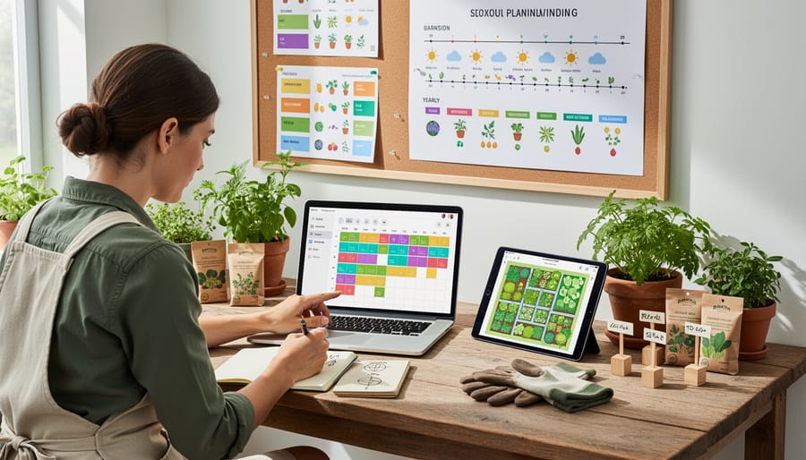
Simple Tools That Don’t Require Design Skills
You don’t need to be a graphic designer to create beautiful garden infographics! Several user-friendly platforms make the process enjoyable and straightforward, even if you’ve never designed anything before.
Canva is a fantastic starting point, offering free templates specifically designed for infographics. Simply choose a garden-themed template, plug in your data about harvest weights, rainfall, or plant growth, and customize the colors to match your garden’s personality. The drag-and-drop interface feels intuitive, like arranging plants in a garden bed.
Piktochart is another excellent option, particularly if you’re working with charts and graphs. It automatically converts your spreadsheet data into clean, attractive visuals. I’ve seen gardeners use it to track seasonal harvests across multiple years, creating stunning comparisons that would make any garden journal proud.
Don’t overlook the charm of hand-drawn infographics, either! A simple garden journal with sketched plant layouts, colored pencils for different crop families, and handwritten notes can be just as effective as digital designs. Many gardeners find this tactile approach more satisfying and personal. Photograph your pages to share with online gardening communities, and you’ve got shareable content that’s uniquely yours.
Turning Your Garden Journal into Visual Stories
Your garden journal holds treasure troves of data just waiting to become visual stories! Start by reviewing your notes from the past season and identifying patterns worth highlighting. Did certain plants thrive in specific conditions? Track your harvest quantities over time? These observations make perfect infographic material.
Begin with simple charts showing your most successful crops or a timeline of bloom dates. Free tools like Canva or Piktochart offer garden-themed templates that make creating visual content straightforward, even if you’re new to design. Focus on one key insight per infographic rather than cramming everything together.
Color-code your data by season or plant family to make information instantly digestible. Include quick reference icons for sun exposure, water needs, or companion planting relationships. These visual cues help you spot patterns at a glance when planning next year’s garden.
Remember, sharing garden knowledge benefits everyone in the gardening community. Your infographics don’t need to be perfect, they just need to tell your garden’s story clearly. Save digital copies in a dedicated folder and print favorites to keep handy during planning sessions. You’ll be amazed how these visual summaries transform scattered notes into actionable insights for seasons ahead.
Where to Find Trustworthy Garden Infographics
University Extension Programs and Research Centers
Your local university extension office is an absolute treasure trove for gardeners seeking reliable, research-backed information presented in clear visual formats. These programs, typically run by state universities, create region-specific infographics that address your exact growing conditions, from soil types to first frost dates. What makes these resources particularly valuable is that they’re developed by horticulturists and soil scientists who understand your climate zone intimately. You’ll find beautifully designed guides covering everything from vegetable planting calendars to pest identification charts, all backed by field research conducted right in your area. Most extension offices offer these infographics free of charge through their websites or local offices, and many are updated annually to reflect the latest scientific findings. I’ve personally watched these visual guides transform confused new gardeners into confident growers who finally understand why their tomatoes weren’t thriving. The best part? You can often request specific topics, and extension agents genuinely want to help you succeed in your garden.
Spotting Questionable Garden Data
Not all garden infographics are created equal, and learning to spot questionable data will save you from planting mistakes and disappointments. Start by checking the source—reliable infographics typically come from university extension programs, established horticultural societies, or experienced gardening organizations with verifiable credentials.
One red flag I’ve encountered is zone-inappropriate advice. If an infographic suggests planting dates without specifying hardiness zones or regional variations, approach it with caution. For example, a beautiful chart showing “perfect tomato planting times” means little if it doesn’t account for your local climate. Always cross-reference recommendations with your specific growing zone.
Watch for overly optimistic yield claims or pest solutions that sound too good to be true—they usually are. Master gardener Elena Rodriguez shared with me that she once followed an infographic promising pest-free gardens through companion planting alone, only to lose half her crop. “I learned to verify bold claims through multiple trusted sources,” she advises.
Check whether the infographic cites research or credits experts. Vague statements without supporting data often indicate the information hasn’t been properly vetted. When in doubt, consult your local extension office or experienced gardening neighbors who understand your specific growing conditions.
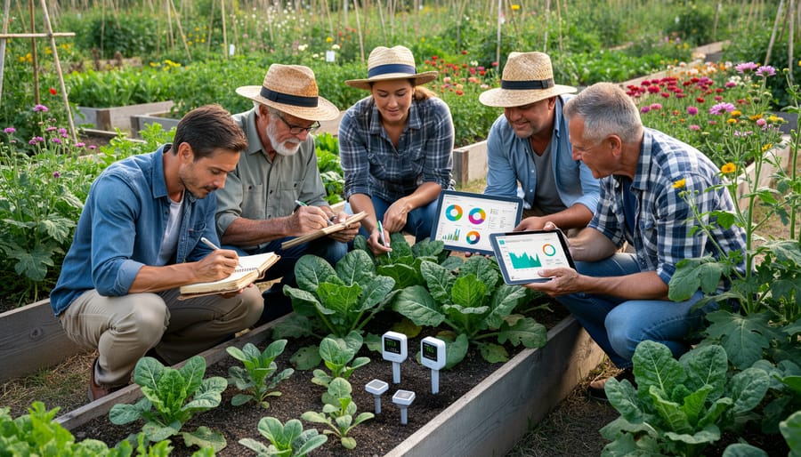
Interview: How a Master Gardener Uses Data Visualization
We recently sat down with Margaret Chen, a Master Gardener with over twenty years of experience, who has transformed her approach to garden management through data visualization. Her story offers inspiring insights for anyone looking to make their gardening more organized and productive.
“I used to keep everything in my head or scribbled in notebooks,” Margaret laughs. “But when my garden expanded to include a vegetable plot, herb spiral, and pollinator meadow, I needed a better system. That’s when I discovered the power of infographics.”
Margaret’s first project was creating a simple companion planting chart. She used free online tools to design a visual guide showing which vegetables thrive together and which combinations to avoid. “Seeing those relationships visually changed everything,” she explains. “Instead of flipping through reference books, I had one colorful chart posted in my shed. My tomatoes and basil have never been happier together!”
Her success with companion planting led her to track more complex data. Margaret now maintains a seasonal planting calendar displayed as a circular infographic, with each vegetable’s planting window color-coded by season. “This visual timeline prevents me from missing optimal planting dates,” she notes. “I can see at a glance that my spinach needs to go in by early September for fall harvest.”
The most impressive application came when Margaret analyzed her garden’s productivity. She tracked harvest weights by crop over three years, creating bar graphs that revealed surprising patterns. “I discovered my green beans consistently underperformed in one bed,” she recalls. “The data visualization made it obvious enough that I tested the soil and found a drainage issue I’d never noticed.”
Margaret’s advice for fellow gardeners? Start simple. “You don’t need fancy software. Even a hand-drawn chart beats no visualization at all.” She recommends beginning with just one aspect, whether it’s frost dates, watering schedules, or harvest tracking.
For those seeking inspiration, our collection of expert gardener interviews offers additional perspectives on data-driven gardening approaches.
“Visual data helps me learn from each season,” Margaret concludes. “Every infographic I create becomes a teaching tool for future growing years. That’s the real magic of combining gardening with data visualization.”
You’ve seen how powerful infographics can be for organizing and understanding your garden data. From tracking soil moisture levels to planning your seasonal rotations, these visual tools transform numbers and observations into actionable insights that make gardening more successful and enjoyable.
The beauty of combining data with visual presentation is that it honors both sides of what makes gardening so rewarding. Yes, there’s science involved—understanding pH levels, frost dates, and companion planting ratios—but there’s also tremendous artistry in seeing patterns emerge and planning your space beautifully. Infographics bridge these two worlds perfectly, letting you make informed decisions while still keeping that creative spark alive.
If you’re feeling inspired but not sure where to begin, start simple. Create a basic planting calendar for your zone, mapping out when to start seeds indoors and when to transplant outdoors. You’ll immediately notice how much easier planning becomes when everything’s laid out visually. Once you experience that difference, you’ll naturally find other areas where infographics can help—whether that’s tracking harvest yields, monitoring pest patterns, or planning next year’s garden layout.
Remember, every expert gardener started somewhere, and adding data visualization to your toolkit is just another step in your growing journey. Happy gardening!