Choose high-contrast color combinations for your garden infographics by pairing dark text with light backgrounds—think deep forest green on cream rather than pale sage on white—ensuring everyone in your gardening community can read planting schedules and zone maps regardless of visual ability.
Add descriptive alt text to every garden diagram and photo by explaining what’s shown rather than stating the obvious: write “tomato plant with yellowing lower leaves indicating nitrogen deficiency” instead of simply “tomato plant,” helping screen readers convey meaningful information to visually impaired gardeners.
Size your text at minimum 16 pixels for body content and 24 pixels for headings when creating seed-starting guides or companion planting charts, making instructions readable on phones held at arm’s length by gardeners with dirty hands or aging eyes.
Structure your visual content with clear hierarchies using headings, lists, and white space—organize your raised bed layout diagrams with labeled sections and numbered steps rather than cramped paragraphs—so readers can quickly scan and find the specific information they need.
Test your garden graphics using free tools like WebAIM’s contrast checker or by viewing designs in grayscale to identify problems before publishing, ensuring your beautiful pollinator garden plans work for everyone.
Replace directional instructions like “click the green button” with descriptive alternatives such as “select the ‘Add to Garden Plan’ button” in your interactive content, accommodating gardeners who experience color differently or use assistive technologies to navigate your tutorials.
What Accessible Graphic Design Actually Means for Garden Content
Accessible graphic design simply means creating visual content that everyone can understand and enjoy, regardless of their abilities or how they access information. When it comes to gardening content, this includes everything from planting zone maps and companion planting charts to step-by-step tutorials and those beautiful garden infographics we love sharing online.
Think about it this way: if you’re creating a diagram showing how to prune tomato plants, accessible design ensures that someone with color blindness can still distinguish between the branches to keep and those to remove. It means someone using a screen reader can understand your garden layout plan. It also helps people browsing on their phones in bright sunlight or older gardeners who might need larger text to read your seed-starting timeline.
Here’s the wonderful truth about accessible design: it genuinely helps everyone. Clear labels on your garden planning graphics make them easier for beginners to follow. High-contrast text on your social media posts means more people will actually read your watering tips. Simple, logical layouts help busy gardeners quickly find the information they need without frustration.
When we talk about accessible graphic design in gardening content, we’re focusing on practical elements like choosing color combinations that work for everyone, adding descriptive text to images, organizing information in a clear sequence, and making sure your beautiful garden photos include helpful context. It’s not about sacrificing style or creativity. Rather, it’s about being thoughtful and inclusive while sharing your gardening knowledge.
The best part? Making your content accessible doesn’t require expensive software or a design degree. Small, intentional changes to how you create and share your gardening visuals can dramatically expand your reach and help more people discover the joy of gardening.
Color Choices That Help Everyone Read Your Garden Graphics
Why Red and Green Together Can Be Problematic
For those of us who love sharing garden content, here’s something important to consider: about 8% of men and 0.5% of women experience some form of color blindness, with red-green color blindness being the most common. This means a significant portion of your audience might struggle to distinguish between these colors when they appear side by side.
Think about how often we rely on red and green in gardening visuals. We use them to show ripe versus unripe tomatoes, healthy versus stressed plants, or autumn versus spring foliage. When these colors sit next to each other without other visual cues, they can look nearly identical to someone with deuteranopia or protanopia.
The good news? Making your graphics more accessible doesn’t mean abandoning these colors entirely. Instead, add patterns, textures, or labels to your images. Use different shades that provide enough contrast, or incorporate additional colors like yellow or blue. When creating a plant health guide, for example, consider using symbols alongside colors, such as checkmarks for healthy growth or warning icons for issues. This way, everyone can enjoy and learn from your beautiful garden content, regardless of how they perceive color.
Tools That Make Color Checking Easy
You don’t need to be a tech wizard to check if your garden graphics are accessible! Several free tools make this process incredibly simple, even if you’ve never thought about color contrast before.
WebAIM’s Contrast Checker is my go-to favorite. Just drop in your text and background colors, and it instantly tells you if they pass accessibility standards. I remember using it for my first seed packet infographic and discovering my pale yellow labels were nearly invisible to many readers. The tool showed me exactly what adjustments to make.
For simulating color blindness, try Color Oracle. This free program shows how your entire screen looks to people with different types of color vision deficiency. It’s eye-opening to see your carefully chosen reds and greens might appear nearly identical to some gardeners. I run all my planting zone maps through it now.
Coolors offers another fantastic option with its built-in accessibility checker. You can build entire color palettes while ensuring they work for everyone.
These tools take just minutes to learn, and they’ve transformed how I create garden content. Think of them as your accessibility insurance policy, making sure every gardener can enjoy and learn from your beautiful designs.
Text Readability in Your Garden Diagrams and Infographics
Font Sizes That Work on Phones and Tablets
When you’re creating garden graphics that fellow gardeners will view on their phones while outdoors, font size becomes especially important. Imagine trying to read tiny text on your screen in bright sunlight with dirty gloves on – not fun, right?
For body text in garden infographics or plant care guides, aim for a minimum of 16 pixels. This ensures readability even when someone’s squinting at their tablet propped against a potting bench. If you’re sharing step-by-step instructions or planting schedules, consider going larger – 18 to 20 pixels works beautifully.
Headings should be substantially bigger to create clear visual hierarchy. Use at least 24 pixels for subheadings and 32 pixels or more for main titles. This helps gardeners quickly scan for the information they need, like “When to Harvest” or “Watering Requirements.”
For text overlaid on photos – perhaps a quote from an expert gardener or a seasonal tip – bump that up to 20 pixels minimum. Garden images often have busy backgrounds with foliage and flowers, so generous sizing helps text remain legible.
Remember to test your designs on an actual mobile device outdoors if possible. What looks readable on your computer screen might disappear in natural daylight.
Making Text Stand Out Against Garden Photos
We’ve all been there—you capture that perfect shot of your blooming dahlias or lush vegetable patch, add some helpful text, and suddenly realize the words completely disappear against the busy background. Garden photos are wonderfully colorful, but that vibrant beauty can make text incredibly difficult to read.
The simplest solution is adding a semi-transparent overlay behind your text. Think of it as placing a soft veil over part of your image. A dark overlay (around 50-70% opacity) works beautifully with white text, while a light overlay suits darker lettering. Most design tools, even free ones like Canva, offer this feature with just a few clicks.
Another effective technique is adding a subtle shadow or outline to your text. This creates separation between letters and the background, making words pop even over complex patterns like latticed foliage or mixed flower beds. Keep shadows soft and close to the text—harsh, dramatic shadows can look outdated and distract from your message.
For those sharing planting guides or garden diagrams, consider using bordered text boxes instead. A solid rectangle with rounded corners feels clean and modern while ensuring every word remains readable. You might even match the box color to flowers in your photo for a cohesive, professional look that celebrates your garden’s palette.
Alt Text for Garden Images: More Than Just Descriptions
When you share your garden photos online, alt text ensures everyone can appreciate your hard work, including visitors using screen readers. But effective alt text goes beyond simply naming what’s in the picture. It captures context, purpose, and the story you’re telling.
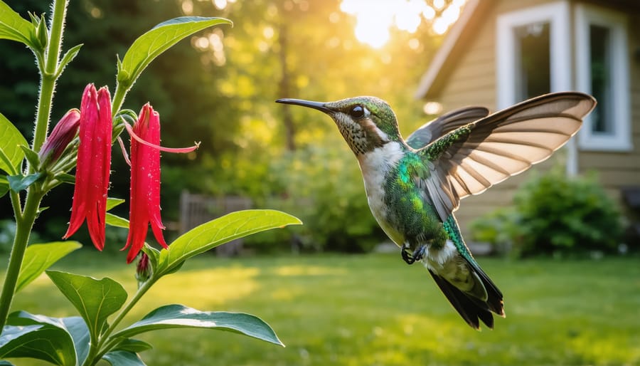
Think about a photo of a tomato plant. Weak alt text might say “tomato plant.” Better alt text would be “Heirloom tomato plant with red fruit ready for harvest.” Even better? “Mature Brandywine tomato plant showing four ripe red fruits and signs of early blight on lower leaves.” The difference is striking. The first version tells us almost nothing. The final version helps someone identify plant health issues, understand harvest timing, and even recognize specific varieties.
For instructional graphics, describe the action and outcome. Instead of “watering can,” try “hand watering seedlings at soil level to avoid damaging tender stems.” This helps readers understand the technique, not just the tool.
Plant identification images need special attention. Include color, shape, distinctive features, and growth stage. “Purple coneflower” becomes “Purple coneflower in full bloom with drooping pink-purple petals and prominent orange-brown center cone, approximately three feet tall.”
Consider your image’s purpose too. Is it decorative inspiration or educational content? A mood shot of your morning garden might warrant “Misty sunrise over vegetable garden with dew-covered kale plants in foreground.” A pest damage photo needs specifics: “Japanese beetle damage on rose leaves showing characteristic skeletal pattern between leaf veins.”
Keep alt text concise but informative, ideally under 150 characters for simple images, longer when detail matters for understanding. Skip phrases like “image of” or “photo of” since screen readers already announce it’s an image. Focus instead on what makes your garden moment worth sharing, giving every visitor the full experience.
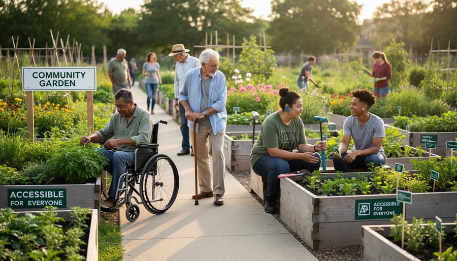
Making Garden Plans and Layouts Accessible
Garden layouts and planning graphics can feel overwhelming when they’re packed with information about plant spacing, companion pairings, and plot dimensions. But here’s the good news: with a few thoughtful adjustments, you can make these essential visuals work for everyone in your gardening community.
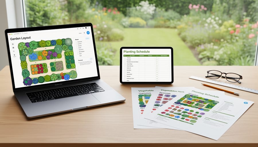
Start by thinking about how different people process information. Some gardeners love a visual plot map, while others prefer a straightforward list. Why not offer both? When creating a garden layout, pair your colorful diagram with a simple text description that outlines what goes where. For example, “Row 1: Tomatoes spaced 24 inches apart, Row 2: Basil planted between tomato plants as companions.”
Color coding is wonderful for companion planting charts, but don’t rely on it alone. I learned this lesson when a reader with color blindness told me they couldn’t distinguish between my “good companion” and “bad companion” categories. Now I use patterns, symbols, or labels alongside colors. Try using a plus sign for beneficial pairings and a minus sign for plants that shouldn’t be neighbors.
Spacing diagrams deserve special attention since precise measurements matter in gardening. Instead of showing tiny measurements in a complex grid, break it down step by step. Create a simple visual showing one plant’s spacing requirements, then explain in clear text how to repeat the pattern across your bed.
Consider offering downloadable versions in multiple formats. A PDF for printing, a high-contrast version for those with vision differences, and even a basic text document all serve different needs. Your fellow gardeners will appreciate having options that match their unique way of planning and dreaming about their growing spaces.
Icons, Symbols, and Visual Shortcuts in Garden Content
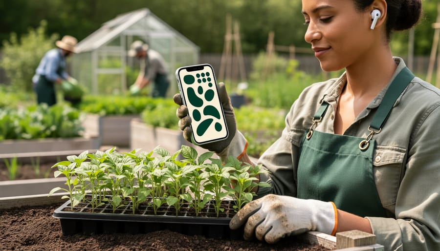
When creating garden content, icons and symbols can quickly communicate important information, but they need to work for everyone. Think about the universal symbols we all recognize: a sun for full sunlight, a water droplet for watering needs, or a snowflake for frost warnings. These familiar images carry instant meaning across different languages and abilities.
However, here’s the golden rule: never let an icon stand alone. Always pair symbols with text labels. What seems obvious to you might confuse someone else. A droplet could mean watering frequency, humidity requirements, or drainage needs depending on context. Adding a simple label like “Water Weekly” removes all guesswork.
If you’re creating custom icons for specific garden tasks like deadheading, transplanting, or mulching, keep them simple and consistent throughout your materials. Use the same visual style, line weight, and color palette so readers can quickly learn your system. Test your custom icons with friends or fellow gardeners before publishing widely.
Consider using high-contrast colors between your icons and backgrounds. A pale yellow sun on white paper disappears for people with low vision. Color alone shouldn’t convey meaning either. If you use red for “danger” or green for “safe,” add supporting text or patterns so colorblind readers won’t miss critical information about plant toxicity or care requirements.
Quick Wins: Small Changes That Make a Big Difference
Let’s start with the easiest wins that’ll make your garden content more welcoming to everyone, right away. Think of these as the accessibility equivalent of adding mulch to your beds – simple steps that yield impressive results.
Begin by increasing your font size. If you’re creating graphics for Instagram or Pinterest showing your planting calendar or companion planting chart, bump that text up to at least 14-16 points. I learned this lesson when my neighbor mentioned she loved my posts but couldn’t read the details without zooming in. Such a simple fix!
Next, embrace contrast. When you’re overlaying text on photos of your gorgeous garden beds, add a semi-transparent box behind the words. Dark text on light backgrounds (or vice versa) ensures everyone can read your hard-won tips about succession planting or pest management. Avoid placing white text directly on photos of your pale pink roses or yellow sunflowers.
Check your color choices using free online contrast checkers. These tools take seconds and confirm whether your color combinations work for people with color vision differences. This is especially important when creating seasonal planting guides or zone maps.
Add descriptive alternative text to every image you post online. Instead of “garden photo,” try “three raised beds filled with leafy lettuce varieties in early spring.” Screen readers translate this for visually impaired gardeners, helping them join the conversation.
Finally, choose simple, readable fonts over decorative scripts. While that curly font might look charming on your seed-starting guide, a clean sans-serif font like Arial or Verdana ensures everyone can actually follow your instructions. Save fancy fonts for brief headlines only.
These changes take minutes but open your gardening wisdom to a much wider community of fellow plant lovers.
Making your gardening content accessible isn’t just the right thing to do—it’s what makes our community truly flourish. When we design graphics, diagrams, and visual guides with everyone in mind, we’re honoring the very spirit of gardening itself: creating spaces where life can thrive in all its beautiful diversity. Every gardener who’s ever shared a cutting, explained the best time to prune roses, or welcomed a curious neighbor into their plot understands that knowledge grows best when it’s shared freely.
The wonderful news is that you don’t need to overhaul everything at once. Start small. Choose one upcoming post and add alt text to your images. Pick colors with better contrast for your next planting diagram. Describe that stunning photo of your tomato harvest in a way that lets everyone experience your triumph. These seemingly modest changes ripple outward, opening doors for aspiring gardeners who’ve felt left out of the conversation.
Remember, accessible design doesn’t limit your creativity—it expands your garden gate. It invites in the visually impaired gardener seeking advice on fragrant herbs, the color-blind enthusiast reading your companion planting chart, and the screen-reader user hungry for your composting wisdom. By making these thoughtful adjustments, you’re cultivating a space where everyone belongs, and that’s when gardening communities truly bloom.