Transform complex gardening information into visual stories that stick in your memory. Download free garden zone maps and planting calendars that condense months of growing data into a single glance, saving you hours of research time. Search specifically for “USDA hardiness zone infographic” or “companion planting chart” to find pre-made visuals that answer your most pressing garden questions.
Create your own infographics using free tools like Canva or Piktochart when you discover information worth remembering. Track your actual harvest yields, frost dates, or watering schedules throughout the season, then turn those numbers into simple bar charts or timelines that reveal patterns you’d otherwise miss. Your personalized data tells a story that generic advice never can.
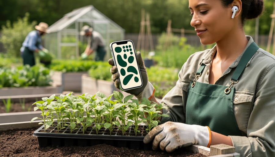
Reference infographics during critical garden moments rather than letting them collect digital dust. Print a pest identification chart and laminate it for your garden shed, or save a succession planting timeline as your phone’s lock screen during spring. The best data visualization means nothing until you apply it to real soil, real plants, and real growing conditions in your own backyard.
Combine multiple data sources into hybrid infographics that answer your unique questions. Overlay your local rainfall data with recommended watering frequencies, or match your actual sun exposure measurements against plant light requirements. This personalized approach transforms generic gardening advice into a precise roadmap tailored to your specific plot of earth, helping you make confident decisions that lead to abundant harvests.
Why Your Garden Actually Needs Data Visualization
Let me share something I’ve learned after years of watching gardeners struggle with the same challenges: we’re great at collecting gardening information, but terrible at organizing it in ways we’ll actually use. That’s where data visualization comes in, and trust me, it’s not just for spreadsheet enthusiasts.
Think about your last garden season. Did you remember exactly when you planted those tomatoes that did so well? Could you recall which herbs thrived next to your lettuce? Most of us can’t, and that’s perfectly normal. Our brains simply aren’t wired to retain dozens of interconnected gardening details spanning months or even years. But infographics transform this scattered information into visual patterns we can understand at a glance.
Here’s what makes visual data so powerful in the garden: it reveals relationships you might otherwise miss. A simple companion planting chart, for example, can show you in seconds which plants boost each other’s growth and which compete for resources. No more flipping through notebooks or trying to remember that basil tip you read somewhere last spring.
Planting schedules become infinitely more manageable when you can see your entire growing season laid out visually. Instead of calculating frost dates and succession planting windows in your head, a timeline infographic shows you exactly when to start seeds indoors, when to transplant, and when to expect harvests. This is especially valuable if you’re combining multiple tested garden shortcuts into your routine.
Garden layouts benefit tremendously from visual planning too. Sketching your beds with measurements, sun exposure, and plant spacing helps you maximize space and avoid overcrowding. Add color-coding for different plant families, and you’ve got an instant crop rotation guide for next season.
Even technical information like soil pH requirements becomes approachable when presented visually. A simple chart showing which vegetables prefer acidic versus alkaline soil beats memorizing numbers every time.
The bottom line? Visual data turns gardening knowledge into gardening action, making you a more effective and confident gardener.
The Most Useful Types of Garden Infographics
Planting Calendars and Seasonal Timelines
Timeline infographics are absolute lifesavers when it comes to staying on track with your garden’s needs. I can’t tell you how many times I’ve missed a planting window simply because life got busy—but a well-designed visual timeline changes everything.
These infographics typically display color-coded bars or segments showing optimal planting dates, transplanting periods, and harvest times across the growing season. They’re organized by hardiness zones, so you can see at a glance that your tomatoes should go in the ground after your last frost date, while cool-season crops like lettuce can start weeks earlier.
What makes these particularly valuable is how they show overlapping tasks. You might discover that while you’re harvesting spring lettuce, it’s simultaneously time to start your fall brassicas indoors. Without this visual reminder, you’d likely focus on one task and completely forget the other.
Creating a planting calendar for your zone prevents those frustrating moments when you realize it’s too late to sow carrots or that you should have started pepper seeds six weeks ago. The visual nature helps your brain register timing in ways that written lists simply can’t match. By incorporating seasonal garden planning into your routine, you’ll maximize every growing opportunity.
Companion Planting Charts
Companion planting charts transform complex botanical relationships into easy-to-scan visual guides that take the guesswork out of garden planning. These infographics typically use color-coded systems or simple icons to show which plants are friends or foes in the garden bed.
I discovered the power of these charts when I planted tomatoes next to my basil last summer, following a simple companion planting graphic. The basil not only thrived but seemed to improve the tomato flavor—a delightful bonus I learned about from the same chart.
The most effective companion planting infographics highlight beneficial partnerships like the classic “Three Sisters” combination of corn, beans, and squash, where each plant supports the others through nitrogen fixation, structural support, and ground coverage. These charts also warn against problematic pairings, such as keeping fennel away from most vegetables since it can inhibit their growth.
What makes these visualizations so valuable is how they distill decades of gardening wisdom into a single, scannable page. Instead of reading through lengthy botanical explanations about allelopathy or nitrogen-fixing properties, you can quickly identify which plants will help your garden flourish. Many charts also include helpful spacing recommendations and harvest timing, making them comprehensive planning tools that you’ll reference season after season.

Garden Layout and Spacing Diagrams
When you’re planning your garden space, a well-designed layout diagram becomes your best friend. These scaled visual plans take the guesswork out of spacing and help you maximize every inch of your growing area.
Square foot gardening infographics are particularly helpful for beginners. They break beds into one-foot squares, showing exactly how many plants fit in each section. For example, you might fit sixteen radishes in one square, but only one tomato plant. These diagrams often include companion planting suggestions, displaying which vegetables thrive next to each other.
Spacing diagrams also show you how to arrange plants by height, placing tall crops like corn at the north end so they don’t shade shorter plants. I’ve learned this lesson the hard way when my sunflowers blocked everything behind them!
Creating your own custom layout is easier than you think. Start by measuring your garden beds and using graph paper where each square represents one foot. Mark pathways for easy access, ensuring they’re at least two feet wide. Label each plant with its mature size and spacing requirements.
Many gardeners now use free online garden planners that automatically calculate spacing based on the vegetables you select. These digital tools let you drag and drop plants, instantly showing if you’re overcrowding. You can even save different layout versions to compare options before planting day arrives.
Pest and Disease Identification Guides
One of the most valuable types of garden infographics transforms the often-confusing world of plant problems into easy-to-scan visual references. These diagnostic charts combine images with data to help you quickly pinpoint what’s troubling your plants.
The best pest and disease identification guides use side-by-side comparisons showing healthy leaves versus affected ones, with clear markers highlighting telltale symptoms. For instance, a good powdery mildew chart might include photos at different infection stages, optimal temperature and humidity data that favors its spread, and percentage statistics on which plants are most susceptible.
I love how modern infographics incorporate actual measurements too. Instead of vague descriptions like “small holes,” quality guides might specify that flea beetle damage appears as 2-3mm circular holes, while caterpillar damage shows irregular edges and measures 5mm or larger. This data-driven approach removes guesswork.
Many gardeners print these visual guides and laminate them for quick field reference. I’ve interviewed several experienced gardeners who keep diagnostic infographics in their garden shed, and they swear it saves hours of online searching when problems arise. Look for guides that include common pest life cycles with timing data, so you understand when to expect issues and can plan preventive measures accordingly. The combination of visual identification with statistical information about prevalence, timing, and severity makes these infographics incredibly practical for everyday garden troubleshooting.
Creating Your Own Garden Data Visualizations
Collecting Your Garden Data
Creating meaningful garden infographics starts with collecting the right information throughout your growing season. Think of yourself as a garden detective, gathering clues that will help you make better decisions next year.
Start by tracking your local frost dates in spring and fall. Mark when you actually see the last and first frosts, not just the predicted dates. This real-world data helps you plan more accurately than general recommendations.
Rainfall is another game-changer. Keep a simple rain gauge in your garden and jot down weekly totals. You’ll quickly spot patterns and understand when supplemental watering becomes necessary. I learned this the hard way after wondering why my tomatoes struggled during what seemed like a rainy summer, only to discover we’d had just two inches of rain in six weeks.
Record your harvest yields by weight or quantity. Note which varieties performed best and which disappointed. Add quick observations about plant health, pest problems, or disease resistance.
The simplest recording method? Use your smartphone’s note app or keep a small notebook in your garden shed. Snap photos regularly to create a visual timeline. These casual records become invaluable data points when you’re ready to create infographics that tell your garden’s unique story.
Easy Tools for Garden Infographic Creation
Creating your own garden infographic doesn’t require expensive software or design expertise. Canva offers free templates specifically designed for infographics, with drag-and-drop features that make adding your planting dates, harvest yields, and rainfall data incredibly simple. I’ve used it myself to track my tomato varieties’ performance, and friends who claim they “can’t design anything” have created beautiful companion planting charts in under an hour.
Garden planning apps like GrowVeg and Gardenate include built-in visualization tools that automatically convert your planting schedules into colorful timeline graphics. These are perfect if you want something functional without fussing over design details.
Don’t underestimate the power of hand-drawn infographics either. A simple pencil sketch showing your garden layout with notes about sun exposure and plant spacing can be just as effective as digital versions. Take a photo, and you’ve got a shareable reference that’s uniquely yours.
Remember, the goal is communicating your garden data clearly, not winning design awards. Start with whatever tool feels comfortable, whether that’s a smartphone app, free online software, or good old paper and colored pencils. Your garden knowledge matters far more than polished graphics.
Making Your Visuals Actually Useful
A beautiful infographic won’t help much if you can’t read it while kneeling in your garden bed! When designing your visual, think function first. Use color coding strategically—perhaps green for cool-season crops, orange for warm-season ones, or different shades to indicate water needs. This makes scanning for information quick and intuitive.
Clear, large labels are essential. Remember, you might be viewing this with dirty hands at arm’s length or in bright sunlight. Choose fonts that remain readable when printed or viewed on a phone screen outdoors. White text on dark backgrounds often works better in varied lighting conditions.
Organize information in a logical flow that matches how you’ll actually use it. For planting schedules, arrange by month or season rather than alphabetically. For companion planting charts, group plants by garden beds or families. If creating complex visualizations feels overwhelming, consider professional garden planning services that include customized visual guides.
Keep it simple. One focused infographic beats a cluttered poster every time. You can always create a series rather than cramming everything onto one page.
Where to Find Reliable Garden Infographics
Finding trustworthy garden infographics can feel overwhelming with so much information online, but knowing where to look makes all the difference. Your local university extension services are absolute gold mines for data-driven gardening information. These organizations conduct research specific to your region and create infographics based on actual field trials and climate data. I’ve learned so much from my own state extension office over the years, and their resources are typically free and science-backed.
Established gardening organizations like the National Gardening Association and Royal Horticultural Society regularly publish infographics grounded in research. Similarly, organizations focused on sustainable agriculture and permaculture often share valuable visual data about soil health, companion planting, and ecological gardening practices. These groups understand the importance of sharing garden knowledge in accessible formats.
When evaluating any infographic, ask yourself a few key questions. Does it cite sources or research? Is the organization behind it reputable? Does the data seem realistic for your growing zone? I once followed an infographic about tomato spacing that worked beautifully in California but needed adjustment for my humid climate where air circulation matters more.
Community gardens and local gardening clubs can also be wonderful resources. Many maintain libraries of infographics tailored to your specific area, which is incredibly valuable since a planting calendar for Texas won’t work in Maine.
Remember that even excellent infographics may need tweaking for your microclimate. Use them as starting points rather than absolute rules. Take notes on what works in your space, and don’t hesitate to adapt recommendations. Your garden’s unique conditions will always teach you something new.
Putting Your Garden Infographics to Work
Creating beautiful infographics is just the first step. The real magic happens when you put them to work in your everyday garden routine.
For outdoor reference, lamination is your best friend. I laminate my companion planting chart and hang it right on my potting bench. When I’m deciding what to plant next to my tomatoes, I simply glance up rather than running inside to check my notes. Many gardeners swear by creating weatherproof versions using sheet protectors attached to clipboards that live in the shed or greenhouse.
Digital gardeners keep their infographics as photos on their phones. This works brilliantly for those quick reference moments at the nursery. One gardener I interviewed, Margaret from Portland, told me she saved a vegetable spacing guide on her phone and references it constantly when transplanting seedlings. She says it’s eliminated her guessing game entirely.
Consider building a garden binder with plastic sleeves to hold your collection of infographics. Organize them by season or topic—planting schedules in front, pest identification in the middle, harvesting timelines at the back. It becomes your personalized garden encyclopedia.
The proof is in the results. Gardeners who use visual data consistently report better timing on planting dates, fewer pest problems because they identify issues earlier, and significantly improved yields. Sarah, a community garden coordinator, shared that their plot holders increased their harvest by nearly 30 percent after she posted seasonal infographics at their garden entrance.
The key is accessibility. Keep your infographics where you actually garden, not tucked away in a drawer.

Garden infographics aren’t just beautiful decorations for your Pinterest boards—they’re practical tools that transform how you approach gardening. By translating complex data into simple visuals, these graphics remove the guesswork that often leads to disappointing harvests or stressed plants. Whether you’re tracking frost dates, planning companion plantings, or timing your watering schedule, having visual references at your fingertips makes you a more confident, capable gardener.
The wonderful thing is, you don’t need to create an elaborate garden management system overnight. Start simple. Print out one infographic about companion planting and tape it inside your shed. Create a basic harvest tracking chart for your tomatoes this season. These small steps add up quickly, and before you know it, you’ll have a personalized collection of visual guides that reflect your unique garden and growing style.
Remember, every experienced gardener was once a beginner who learned through observation and adjustment. Adding data-driven infographics to your toolkit simply accelerates that learning process, helping you spot patterns faster and make smarter decisions. So grab that graph paper, open that design app, or print that helpful chart you’ve been eyeing. Your future self—and your thriving garden—will thank you.